Data Visualisation for Research Institutions, Charities & NGOsData Visualisation
Bespoke dashboards and reporting tools that bring your research data, programme outcomes, and funder reporting into one clear, defensible view, built around the questions your researchers, programme leads, trustees, and funders actually need answered.
Most research institutions, charities and NGOs we work with hold data across systems that were never designed to talk to each other. Programme delivery sits in a case-management tool like Salesforce, Lamplight, or Charitylog. Survey and study data sits in Qualtrics, REDCap, or Microsoft Forms. Grant and finance information sits in a finance system or a grant-management database. Researchers each keep their own working spreadsheets. And every funder report, trustee paper, ethics return, or impact summary has to be reassembled by hand from all of it.
That’s the gap we fill. We build bespoke dashboards and reporting tools that sit on top of the systems your team already uses, pulling data in automatically and presenting it around the questions you actually need to answer: for researchers, for programme managers, for trustees, and for the funders you report to.
We’re careful about the things that matter most in research and the third sector: data governance, ethics approvals, GDPR, and the difference between exploratory analysis and an evidence base you can defend in a peer-reviewed paper, an annual report, or a grant renewal.
What we build
Research and programme operations dashboards for the people running studies and services day-to-day: recruitment progress against targets, data-collection completeness, response and retention rates, beneficiary throughput, programme delivery against milestones, data-quality flags. Refreshed close to real time, and designed to surface the exceptions that need attention rather than drown teams in headline numbers.
Impact and funder reporting: outcome metrics against grant agreements, beneficiary demographics and reach, longitudinal change indicators, theory-of-change progress, evidence summaries for trustees, boards, and funders. The kind of reporting that currently gets rebuilt from scratch every quarter, automated once and delivered on a schedule.
Self-service tools for researchers and analysts: interfaces that let researchers, fellows, or programme analysts cut and explore their own datasets (survey results, longitudinal cohorts, instrument outputs, programme records) without waiting in a queue for the data team or wrestling with raw exports.
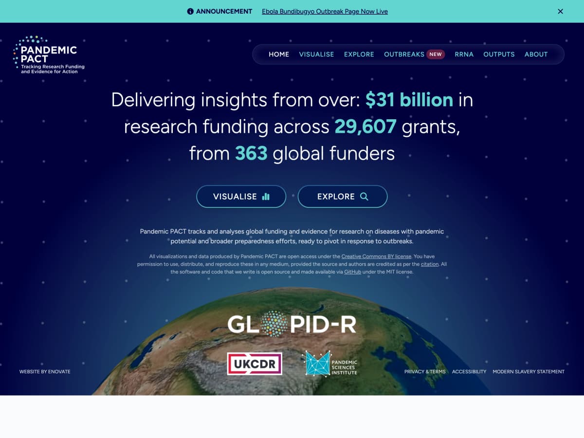
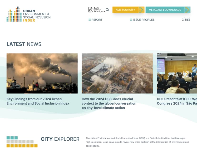
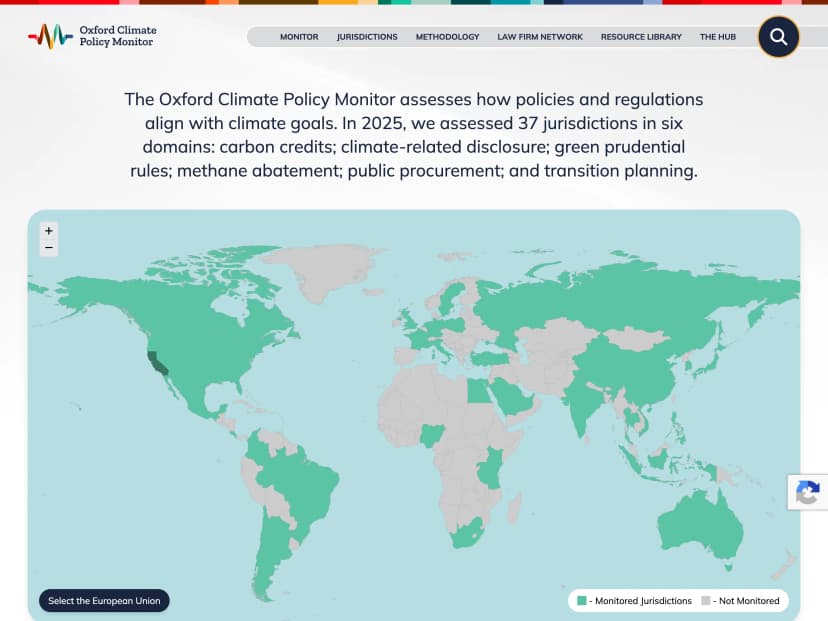
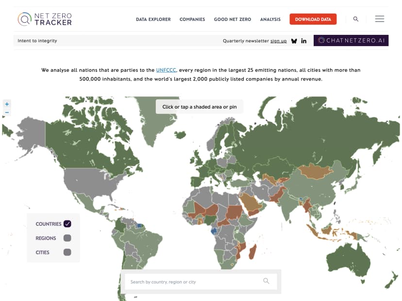
Public-facing data visualisations: interactive dashboards and one-off visualisations for annual reports, advocacy campaigns, published research, or open-data initiatives. Built to be accurate, accessible, and defensible to peer reviewers and a lay audience alike.
How we build it
Our default stack is Laravel with a modern front-end, which gives us the flexibility to pull from almost any API, database, spreadsheet, or research instrument, and to present the result in a way that matches your institutional brand and the specific questions your team is asking. We can also embed charting libraries directly into existing Craft CMS or Laravel sites we’ve built, so a public-facing dashboard lives inside the website your audience already visits.
For teams that prefer an off-the-shelf platform (Metabase, Looker Studio, Power BI, or similar) we’re happy to set that up and handle the data pipeline and governance work that sits behind it. The right choice depends on your budget, your data sources, the sensitivity of the data, and how much customisation you need. We’ll help you decide, with an eye on long-term sustainability rather than a one-off project.
Who it’s for
Data visualisation suits research institutions, charities and NGOs that:
- Hold data across multiple systems and lose time reformatting it for every funder report, board paper, or ethics return
- Need reporting tailored to specific grant outcomes, ethical commitments, or research questions, not a generic SaaS template
- Want researchers, programme leads and trustees to see current information without chasing the data team
- Have a duty to demonstrate impact transparently to funders, beneficiaries, peers, or the public
- Are considering AI or automation projects and need clean, well-governed data foundations first
Dashboards often turn out to be the first step in a longer journey. Once an organisation can see what’s happening across its research and programmes clearly, the next question is usually “what does this evidence tell us?” or “can we predict outcomes for the people we work with?”, which is where our AI Implementation work takes over.
Get in touch if you’d like to talk through what’s possible with the data you already have.
Related projects




Thank you so much, Dan! We are thrilled with the new site and it's been a pleasure working with you and your team.
How we work
A proven process that delivers predictable results. No surprises, just steady progress toward your goals.
Discovery
We start by understanding your goals, audience, and constraints. Through workshops and research, we define the project scope and success criteria.
Strategy & wireframing
We map out the user journey and information architecture. Low-fidelity wireframes let us test ideas quickly before committing to design.
UX/UI design
Visual design that balances aesthetics with usability. We create interfaces that look great and guide users effortlessly toward their goals.
Development
Clean, well-documented code built on proven frameworks. We develop iteratively, sharing progress regularly so you're never in the dark.
Quality assurance & launch
Applications and integration-heavy builds ship with automated test suites, and every project is checked across devices and browsers before it goes live. We handle deployment and keep the launch itself uneventful.
Ongoing support
Our relationship doesn't end at launch. We provide proactive maintenance, security updates, and responsive support to keep your product thriving.
Our technology stack
We choose tools that stand the test of time. Proven frameworks, robust infrastructure, and technologies our team can maintain long after launch.


Explore all Data Visualisation services
Turning the data sitting in your systems into dashboards, reports, and visualisations your team actually uses to make decisions.
Services
- For Business
- For Research & Charities
Ready to start your project?
Let's discuss how we can help you achieve your digital goals. We typically respond within one business day.